Live Optics | Optical Prime | VM Provisioning Contrast
Summary: This article offers some observations on Optical Prime's VM Provisioning Contrast data.
This article applies to
This article does not apply to
This article is not tied to any specific product.
Not all product versions are identified in this article.
Instructions
With VM sprawl, there comes some detachment to how resources are provisioned to VMs. The three major elements of provisioning are vCPU, Memory, and Capacity.
With the VM Resource Distribution you can clearly see how many VMs are uniquely configured with a disproportionately heavy number of resources. The next question will obviously be which VMs are the uniquely configured and how unique are they.
Rarely a VM is heavily configured in all three categories. Most often a VM has one unique attribute and sometimes it has 2.
The goal of the Provisioning Contrast graph is to visualize these uniquely configured VMs by graphing the balance of any two of these major resource categories.
VMs are often provisioned by templates or scripts that are designed to bring predictability to the environment. However, over time these configurations can grow unnoticed.
Provisioning Contrast is going to show up to the top 200 VMs in one of six sortable configurations.
The following are example graphics all from the same VM dataset. What is great about this is that although each view is similar in nature, each one shows a different perspective of where the heaviest provisioned resources are allocated.
Sort by vCPU
vCPU over Memory:
The VMs with the highest number of vCPU assignments display on the top row. They are sorted highest to lowest, and they are contrasted by the total amount of memory assigned to the same machine.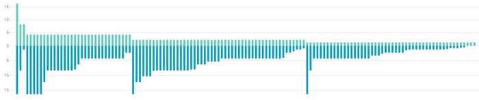
vCPU over Capacity:
The VMs with the highest number of vCPU assignments display on the top row. They are sorted highest to lowest, and they are contrasted by the total amount of capacity assigned to the same machine.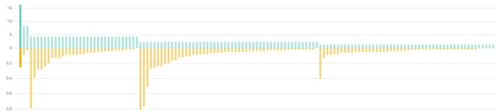
With this example, you can clearly see some fairly obvious patterns.
- Except for 1 or maybe 3 VMs, vCPU assignments are predictable.
- In contrast, capacity and memory assignments are not as standardized. In each major section of similarly assigned vCPUs, each section has a few disproportionally and heavily assigned VMs.
- Memory and Capacity, however, seem to have a coinciding allocation of higher memory assignments when increased capacity is given to the VM.
Sort by Capacity
This is actually the exact same dataset as the graphic shown above. The only difference here is that the top 200 VMs are now sorted by highest to lowest capacity assignments.
Now we can clearly see that vCPU and memory assignments in relationship to capacity are random.
Capacity over Memory:
The VMs with the largest amount of capacity assigned display on the top row. They are sorted highest to lowest, and they are contrasted by the total amount of memory assigned to the same machine.
Capac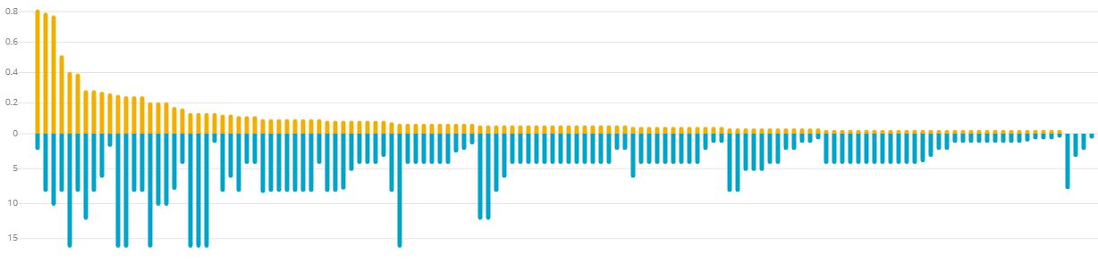 ity over vCPU:
The VMs with the largest amount of capacity assigned display on the top row. They are sorted highest to lowest, and they are contrasted by the total number of vCPUs assigned to the same machine.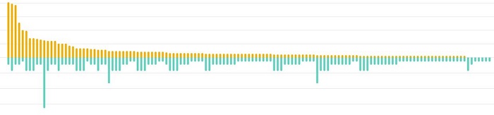
Sort by Memory
Memory over vCPU:
This is the inverse of the previous graph by swapping the sorting value to Memory vs. vCPU. The VMs with the highest amount of memory assigned display on the top row. They are sorted highest to lowest, and they are contrasted by the total number of vCPUs assigned to the same machine.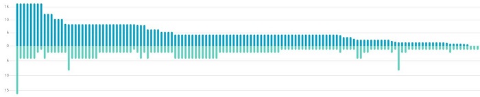
Memory over Capacity:
The VMs with the highest amount of memory assigned display on the top row. They are sorted highest to lowest, and they are contrasted by the total amount of capacity assigned to the same machine.
In this example, you can clearly see the uniquely provisioned VMs with high capacity to their memory assignments.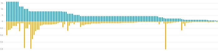
Additional Information
If you have any questions, please reach out to Live Optics Support at liveoptics.support@dell.com.
Affected Products
HS Series, Modular Infrastructure, Rack Servers, Tower Servers, OEM Server SolutionsArticle Properties
Article Number: 000233565
Article Type: How To
Last Modified: 27 Jun 2025
Version: 4
Find answers to your questions from other Dell users
Support Services
Check if your device is covered by Support Services.