PowerEdge: Live Optics - Storage - Storage Workload Concentration (SWC)
Summary: This article offers some observations on Storage Workload Concentration (SWC) data.
Instructions
Storage Workload Concentration (SWC) is a representation of the facts about storage LUNs/Volumes.
This shows which drives (LUNs/Volumes) generate the most activity and their proportion to overall data capacity, allowing quick identification.
SWC is similar but has differences from Server Workload Concentration. SWC: Bubble Graph As Live Optics collects the current environment, it understands the capacity and performance of each object.
In this document, an object includes any LUN, Volume, Datastore, or Internal Capacity disk mapped back to a storage array that donates to the overall capacity figure determined by Live Optics in the project summary. SWC is simply a plotting of the relationship of those object's performance (IOPS) over capacity. The plotting of each bubble is slightly different than Server Workload Concentration. The 95th% is not used as the placement indicator, instead the Total % IOPS contribution is used. As an example, if the SUM (reads+writes) for the entire sample period showed that LUN A contributed 23% of all IOPS, then that bubble would show at the 23% marker on the vertical scale. Each of those objects is then plotted in a graph like the sample below, with the highest-performing objects on the upper leftmost and the lowest performing objects on the lower far right. Therefore, the height of each "bubble" is representing the amount of IOPS in relation to all other bubbles. The diameter of the bubble represents the Used Capacity of that disk.
The wider the bubble, the larger in capacity the disk The horizontal axis demonstrates all capacity from the environment. There is an arbitrary 20% capacity line drawn in the graph for creating a calculation of what amount of IOPS falls into what amount of capacity. This is commonly seen as Skew and can be calculated in various methods.
Live Optics adds up the total % IOPS of the bubbles (or partial bubbles) that fall on or to the left of the 20% line. Those objects total % and their capacity define the concentration value. The color indicator assigned to each bubble Introduces the additional attribute of Quality of Service.
Green is a healthy average latency, yellow represents a potential area of concern, and red indicates a disk that potentially must be inspected. By no means are these colors a predictor of a problem. They are a visual indicator of the facts.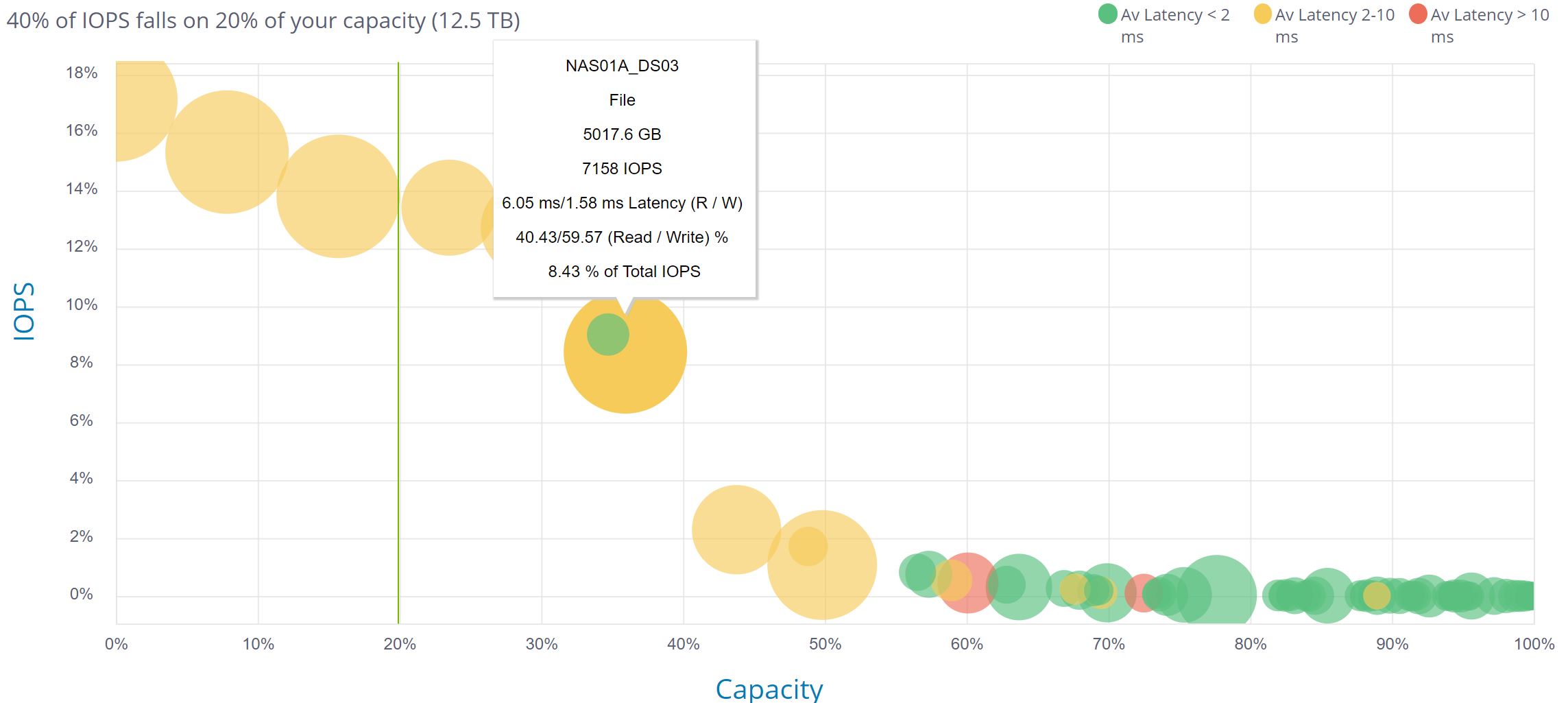
Researching a Potential Problem
The Bubble Chart becomes more insightful when the project has a higher number of objects. In a single figure, you can see hundreds of objects and zoom or focus to the areas in which you want to concentrate.
The Server edition of this chart uses application-level latency responses times. Server values include the Storage response in the total response time. However, the Storage version of the chart represents latency only on the array and the legend reflects millisecond values found acceptable for Storage response times.
If a server has a 20ms response time and the storage array has 2ms, then 18ms of latency is due to other factors.
The Workload Chart (WC) Bubble chart may look overcrowded if there are hundreds of disks or minimal performance variation among the bubbles.
As seen at the far right of the example above, when there are many similar performing bubbles. The graph can produce a "snake" like effect which makes it hard to isolate a bubble.
The chart can be zoomed with the graph controls below the chart to see the dense regions of bubbles.
Each bubble can be "hovered over" to see the objects name, performance, capacity, and role.
Bubbles marked with a gray color represent a disk that does less than 100 IOPS in either reading or writing. Low I/O disks can skew latency averages, and these disks can be ignored. You can read more here.
Additional Information
If you have any questions, please reach out to Live Optics Support at liveoptics.support@dell.com.