Live Optics | Peak Composite Graphs
Summary: This article offers some observations on Peak Composite Graphs.
This article applies to
This article does not apply to
This article is not tied to any specific product.
Not all product versions are identified in this article.
Instructions
In Live Optics, Peak Composite Graphs are different than Aggregation Graphs.
Aggregation graphs take similar values, SUMs or aggregate them and create a new value that represents the whole.
For example, Port 1 has 32 MB/s of throughput and Port 2 has 20 MB/s of throughput. 32+20 can be aggregated to show that the total throughput is 53 MB/s.
A Composite Graph is made up of parts that are related but must be tracked individually. In other words, summing the values does not lead to a truth.
For example, if Port 1 is at 95% utilization and Port 2 is at 5% utilization, the array is not at 100% port utilization. Port 1 is in trouble and Port 2 is underutilized.
For this reason, we have created what we call a Peak Composite Graph and the rest of this write-up helps to understand how it is constructed.
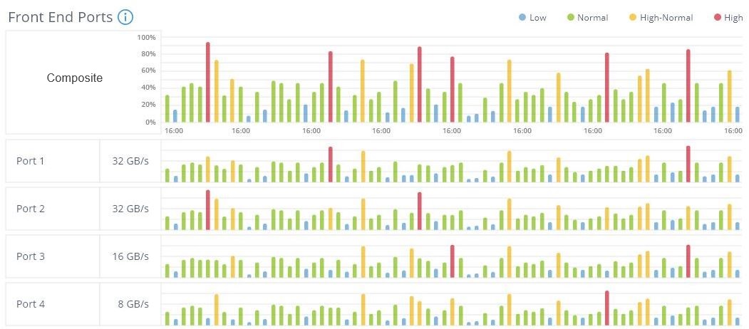
Live Optics plots a timeline of the sample data retrieved. Let us assume that we have these four ports that are all doing a similar duty, but what matters is if any of the ports are exceeding our threshold of 80% utilization. If any port violates this threshold, it is a problem. From a dashboard perspective, it does not even matter which one.
The Peak Composite Graph looks across all the objects being measured and report the Peak value to the Graph.
To illustrate, the graph below shows the Peak Composite, meaning the highest Peak from all four ports is elevated to be the reporting value in the Composite graph. More than one port exceeding the threshold (or a tie) is not relevant. We know that then there was a utilization threshold exceeded on the array.
Hovering over the indicator in the Peak Composite Graph tells that the threshold that was exceeded.
Fig 1: In the mocked-up chart below the highest peak red bars are elevated to be represented in the overall Composite Graph.
The Peak Composite Graph will always show a fixed number of plot points. So no matter what the recording duration or sample rate, they are fixed. Live Optics uses a roll-up technique that is dynamic based on sample rate and sample duration to optimize the graph but leave the outcome the same.
Example: If 10 samples are rolled into 1, then the highest sample value of the 10 samples would represent the set in the roll-up.
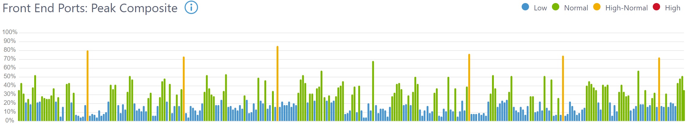
Here is a real-life example of a rather average sample set.
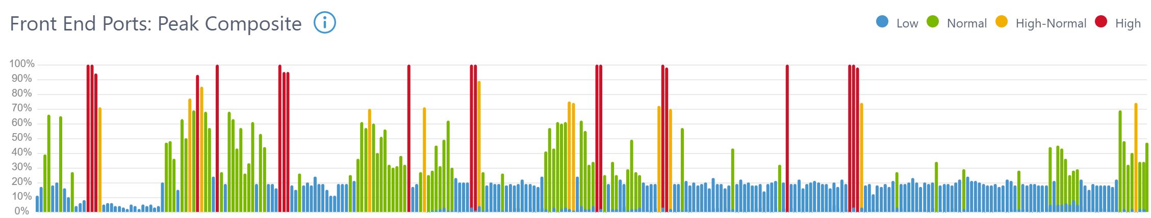
Here is another real-life example where the samples indicate that attention might be needed.
Additional Information
If you have any questions, please reach out to Live Optics Support at liveoptics.support@dell.com.
Affected Products
LiveOpticsArticle Properties
Article Number: 000233587
Article Type: How To
Last Modified: 18 Feb 2026
Version: 3
Find answers to your questions from other Dell users
Support Services
Check if your device is covered by Support Services.